Tuesday, June 9, 2015

Final Exam


1. 
2. 
3. 


4. This is my decisive photo:

I feel like I did not take photography seriously as an art form until I had to use my camera from a new and interesting angle. This was the catalytic photo that made me think outside the box, and it consequently changed my perspective of photography. 

5. Shape is the physical parameters of the object or subject strictly in two dimensions, like the shape of a leaf. Form is the overall three-dimensional space that the subject occupies, like the form of a statue.

6. Pattern is a recurring theme or aesthetic that appears in photography, like the pattern on a cloth. Repetition is, as its name suggests, a repeating object or subject along a specific line in the photograph (like a row of trees.)

7. Here is the example photo for movement:

This photograph exemplifies movement based on subtle visual cues. Along the left side, the concrete barriers are blurred, indicating motion. The pavement of the road is blurrier the farther away it gets from our car. This is because of a phenomenon called "motion parallax," which shows that our family car is in motion. The other cars on the road are traveling at similar speeds to our car, so they are a lot less blurry than if I took the photo while standing still.

8. This was my best work out of the past 3 projects: 
I believe this is my best work because I effectively utilized shallow depth of field. I was satisfied with my photos for this project, which is somewhat rare. 
This project didn't have significant personal impact on me, but I found that I enjoyed photography enough to practice on my own time. I considered buying a Canon camera after the presentation project because of my new-found interest. 
The project did affect my perspective of photography. I realized that photography (and the arts in general) is at its finest when the artist is not confined to set boundaries or rules. The Presentation Project was free-spirited, because we were allowed to choose our topics. While we did have to receive approval, it was a lot less regulated compared to the other projects.


Friday, May 29, 2015

Second Period
Estell Kim
Her subjects look genuinely happy, and the sunlight illuminates their faces very nicely.


Third Period
Jason Stiltz
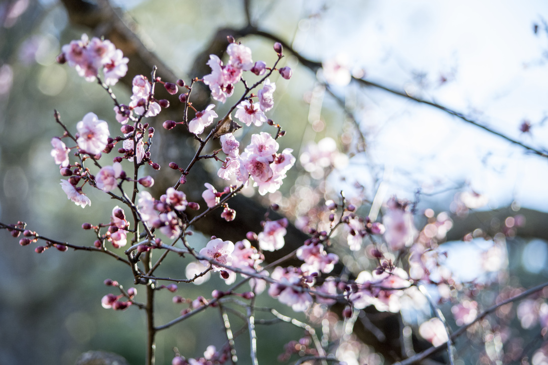
I personally really like cherry blossom flowers and shallow depth of field. The depth of this picture and composition come together very well.


Fourth Period
Nisha Ramesh
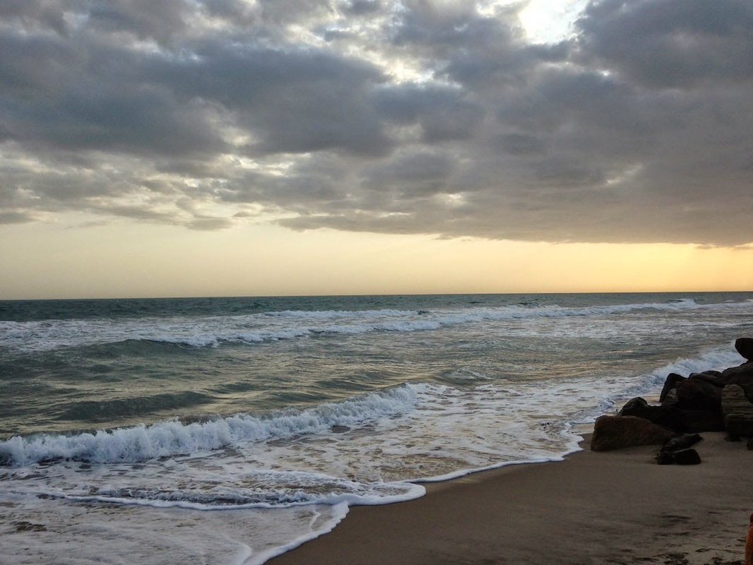
I love the colors of the photograph and the overall composition. The horizon line contrasts the teal ocean and the golden sunset. The clouds give the atmosphere a pensive feeling.
Picture

Final Project Proposal

Topic: Coffee and Tea
Details: Home-made brews, Starbucks, Lattes, etc.

Style of Photography: Bokeh/Shallow Depth of Field

Location: My house, Starbucks

Time of Day: Morning, Afternoon

3 Examples:
1. Coffee Shot by Nina's Clicks (flickr , website)
2. Untitled by carlos buenos (flickr , no website)
3. Untitled by Minato (flickr , no website)

Lens: 55mm

3 Rules of Composition
1. Shallow Depth of Field
Accomplished by increasing the 'f' number, which will consequently increase the depth of field. 
Accomplished by aligning the main subject within the perimeters of the golden ratio areas (roughly a 1:1.618 ratio per area.)
Accomplished by using a unique perspective, usually thought-out beforehand (example: bird's-eye view versus close-up.)

Tuesday, May 19, 2015

Presentation Proposal

Flower: Roses
Photography Style: Extreme Shallow Depth of Field/Bokeh Background
Location: My Backyard, or rosebushes around my neighborhood
Time of Day: Late Afternoon or Evening
Varieties
Examples:
Untitled, by Yiu Yu Hoi. (website)
Untitled, by basave, (website
Rose 'Gabriel' by Myu Myu (website)

Thursday, April 16, 2015

Multicultural Post Day 2


I felt detached from the Taiwanese aspect of myself until I mentally matured, and the opportunity to visit Taiwan revived my sense of cultural identity. The two processes coincided, and I realized that my "American" and "Taiwanese" sides are not two parts of a whole, but rather a conglomeration that is wholly unique and peacefully coexistent. This is a picture I took on my way to Taiwan.

Wednesday, April 15, 2015

Multicultural Week Post

In 2011, Multicultural Week came in a sudden and unexpected blur of excitement. The only thing my naive freshman self knew was that for the first time, there was a huge variety of extremely good food on campus. In the span of four years, I've come to understand the significance of cultural coalition within our school. Food is definitely one component, but the overall theme is focused on taking pride in your heritage, and respecting and admiring that of others.

Many of us cannot dissociate our American side from our original culture. It is factually incorrect to say we are strictly American, but it is also wrong to say we are truly Chinese, Taiwanese, Vietnamese, Indian, etc. Most of us are united in our American upbringing (having grown up in California), and thus Multicultural Week is a time for students to celebrate all aspects of their cultural identity.

Monday, April 13, 2015

Principles of Design - Unity


I took this photo on my way to New York City during Spring Break. 
Edits: Increased contrast, decreased shadow, increased vibrance. Tinted the photo pink. 

This photo conveys unity in the sense that the drawbridge's poles converge, making the structure seem more consolidated.

Thursday, April 2, 2015

Shutter Speed

The Picture I Chose
1.  Fast Shutter Speed
2. Rule of Composition: Leading Lines
3. Element of Art: Form
The trucks have form in that they are three-dimensional. You can see multiple sides and angles from the viewer's perspective.
4. Principle of Design: Movement
The trucks appear to be in motion, moving away from the subject. Although the shutter speed is fast, you can still tell that the trucks are in motion based on the slight blur around their figures.

This photo demonstrates fast shutter speed (1/200), the figures are not blurred even though they are running.

Friday, March 27, 2015

Lens Warm-Up: Documenting the Blues

My Favorite Photo from the Gallery

This photo is my favorite because of the smooth blend in contrast and emotion. The only colors are black and white, but the stark contrast intensifies the joyous expressions of the adult and the child. The bonding between the child and the adult demonstrates unity. There is unity in their connections of happiness against the struggles of poverty. 

Thursday, March 26, 2015

Principles of Design - Variety


Edits: Increased Contrast and Highlights.

This photo has variety in its lighting. The forefront of the picture is tinged goldenrod because of the direct reflection of the walkway with sunlight. The farther the walkway gets from the viewer's perspective, the more shadows there are. However, the sky lights the background with a bluish tint. The inconsistency in lighting emphasizes the variety of this picture.


Wednesday, March 25, 2015

Principles of Design - Rhythm


Edits: Increased Contrast, Decreased Shadow.

This photo conveys Rhythm in that the rafters cast a shadow onto the building wall. The grating and lines of the structure are eye-catching and unique aspects that contribute to the rhythm. 


Monday, March 23, 2015

Movie Monday - Half Past Autumn Questions Part 2


  1. I define success as the ability to be able to look back upon your initial starting point and to be proud as to how far you have progressed as an individual. 
  2. I gave up parts of my individual character that were not contingent with my success to attain my dreams.
  3. Parks relinquished his common sense when he gave up his position of nonviolence. He also gave up inputting his creativity and individuality in his photography to make money from films. 
  4. Genevieve Young's father was 
  5. Parks was advanced $10,000. 
  6. Elijah Muhammad offered $25,000.
  7. Parks refused the money because he wanted to make movies out of his love for film-making, not out of desire for wealth.
  8. The Learning Tree was the first movie directed by an African American.
  9. Shaft was the first African American hero to appear on television.
  10. Gordon's weapon of choice was his camera.
  11. Genevieve Young said that things beyond our control happen sometimes.
  12. Odyssey is similar to
  13. Gordon Parks Jr. passed away in a plane crash.
  14. My favorite photo by Gordon Parks is the one with a black mother and her daughter standing at the movie theater.
  15. In 10 years, I will remember Parks for his passion for photography and the human spirit.

Friday, March 20, 2015

Principle of Design - Proportion


This photo conveys proportion because it roughly follows Rule of Thirds.

Thursday, March 19, 2015

Principle of Design - Repetition


Edits:  Increased lighting, contrast, and saturation. Decreased shadow. Made the lighting more pinkish. 

This photo conveys repetition. The locks on the lockers are spaced equally, and they repeat continuously along the same line of perspective.

Tuesday, March 17, 2015

Principle of Design - Pattern


Edits: Increased contrast, shadow, and vibrance. 

This photo emphasizes pattern. The grooves in the wood panels are patterns on the wall, because they repeat consistently and continuously. 

Thursday, March 12, 2015

Principles of Design - Movement

Edits: Increased contrast, vibrance, exposure, and highlights.

This photo conveys movement because the cars are captured while in motion. The branches of the trees are a bit blurry, since they were swaying with the slight breeze. 

Wednesday, March 11, 2015

Principles of Design - Emphasis


Edits: Increased contrast, saturation/vibrancy, and shadow. Decreased exposure.

I believe that the contrast between the roof and the sky creates an emphasis on the bird. There's also a disparity in color. The building displays several shades of blue, and strongly contrasts against the white sky.


Tuesday, March 10, 2015

Principles of Design - Balance


Edits: Increased saturation/vibrancy, shadows, and contrast.


 Edits: Increased contrast and lighting.

These two photos convey balance because of the weight and position of the "subjects." The first photo has a symmetry to it: the lights line up along the middle. The second photo conveys balance because it is the intersection of the first floor's roof, the floor of the walkway, the stone wall, and the sky. The elements neatly overlap, so there is not too much weight on one single element. Thus, the second photo captures the principle of balance. 

Friday, March 6, 2015

Elements of Art Project


Line above, Space to the right.
Line: Increased saturation, vibrancy, and light/shadow.
Space: Increased saturation, contrast, and light colors.
Shape above, Form to the right.
Shape: Increased saturation, contrast, and vibrancy.
Form: Increased lighting and contrast. Decreased shadow.

Space above, Color to the right.
Space: Increased saturation, lighting, and contrast.
Color: Increased lighting and contrast.

Texture (both above and to the left): Increased saturation, vibrancy, lighting, and contrast.